Wednesday 29 February 2012

Acoustic Music Questionnaire

I've designed and created a questionnaire to explore more information about my target markets interests. I asked primarily females but a few teenage guys too, to get a wide range of answers. I thought it would be best to ask both open and closed questions so I could get their full opinion, to present me with more useful information to help me with my magazine. There are a few pictures included to help me decide which type of picture my target market would prefer on their front cover and double page spread. These results will influence my decisions that I will make in the future of creating my magazine.Acoustic Music Questionnaire
View more documents from catherinebaker16

Magazine Titles

I am undecided about what to call my music magazine, so I created a brain storm to help me with this decision. I looked on the internet to find music related words, to give me inspiration and wrote down all the words, which came into my head about this genre. The three that stand out to me the most are "Tuned In", "Harmony" and "Inspire" and I'm still unsure which one to pick, therefore, I will ask my target audience first by a questionnaire to see what they think and then explore which of these names looks better on my front cover and try out different fonts and logos to decide on the final name.


Comparing My Second Drafts Against My Third Drafts

Again, like my "comparing my first drafts against my second drafts", I thought it would be easier to see all of the changes I have made from my second drafts to my thirds and how much progress I am making so far, by placing the the before and after (second and third draft of each page of my magazine) side by side....


Front Cover:


Contents Page:

Double Page Spread:


Monday 27 February 2012

Inspirational Photos

Whilst doing some research for my previous blogs, such as my mood board and artist research, I came across several pictures that I liked the look of that might inspire me, when I take my photo for my magazine. These pictures are possible poses that my model could pull, which would convey the certain ideologies I would like to create...
Conclusion:
Out of all these photos, the natural imagery seems to be a typical convention portrayed throughout, which I think I should definitely stick to as it reflects the music genre. Another ideology that I will take into consideration when taking my photos, is the use of direct mode of address. The majority of photos use eye contact, which I believe will intrigue the audience to read the magazine and make it look more effective. So I will take pictures of my model with direct mode of address and without to see which one looks best. I believe the picture of Kate Walsh playing her guitar is good as is genuinely looks like she is playing her instrument, however, by the picture being inside, doesn't represent the genre as much as they ones in fields and captured outside, on a sunny day. Therefore, I shall take these reflections, when choosing my locations to take my pictures for my front cover, contents page and double page spread.

Sunday 26 February 2012

Recce Pictures

As I have decided to do an acoustic magazine, I have looked at where artists from this genre generally set their music videos, their photo shoots and a variety of images on the internet to help create an ideology of this genre. By doing all this research I have gathered that they are typically set outside in the countryside on a warm, sunny day. Therefore, I have visited to a variety of places around where I live, to find a suitable located for my photos for my magazine. The majority of recce photos that I have taken seem to include, trees, fields and countryside, so they may look similar, however, this is the certain ideology that I am trying to achieve and I should stick to these conventions that you would typically associate with this genre.


I like this picture due to the use of bright green colours, which connote nature, that links in with the ideologies of an acoustic genre. The model could lean against one of the trees, or even sit down next to on (like the people in the picture) whilst playing their acoustic guitar.


With this photo, you could have the model sit on the gate, playing the guitar, or even looking into the distance to create an atmospheric image to again represent the music genre. Also, I like how the sun is facing the camera and sort of merges in with the rest of the photo. I may try and take some pictures of my model in front of the sun to experiment and see what the natural light would be like. Additionally, it could create a flare in the background, which could give an extra edge to the picture.


This probably has more connotations of a country themed magazine, however, I liked how the setting was different from the rest of the photos that I have taken and the natural feel you get from it. I'm undecided whether to use a background like this as people mistake my magazine to an country one and may get confused to which chosen genre I have chosen to do.
.
 I believe out of all the pictures, I have taken, this one really stands out and creates the ideology of an acoustic magazine I am trying to create. The use of the horse, included in the image, links well to the idea of nature, however, the only downside is that if I got closer to the horse, it may have moved and I'm not sure if it will be there still when taking my pictures for my magazine. The main thing that I will taken from this photo, is the use of natural light, the sun should definitely be included on my magazine, because if I take pictures on a cloudy day, you won't get the same affect to portray the acoustic ideologies I want to create.


The use of the lake in this picture, I believe fits in well with my chosen music theme, as you could get my model to sit beside the edge, or dangle her feet in, whilst playing the guitar or something along those lines. Also, there is a lot of space to the right had side of the picture, which could be a good layout for a double page spread. Therefore, I could try and that I take pictures that have at least one main element in, like a tree and then have the rest as a countryside background, to add text on later on about my chosen topic for my article.


By having a park bench in this picture, my model could sit on this, whilst playing or holding the guitar, to create an acoustic feel to the image. The only downside to this picture is that you can see houses and cars in the background, which do not connote or fit in with my natural ideologies. Therefore, I will have to take my pictures somewhere else, or further along to find a bench for my model to sit on, or even edit it out later on, in post production.


To me, this is a rather pretty photo (same about the cloudy day) however, the blossom, blooming on the trees, represent the idea of my music magazine, as I am aiming it at young teenagers would are aiming to grow into successful musicians. Also, the natural imagery of the blossom, connotes the ideologies I would like to create to portray an acoustic feel to my magazine, so the audience seeing my publication and straight away tell what music genre it is.

Conclusion:
To get the best possible images for my magazine, I believe that I may need to go to a variety of locations to find the perfect picture that look best as a front cover, contents page and a double page spread, like I have done for my recce photos. The typical conventions that I will keep in my photos will be:
  • taking the pictures on a sunny day
  • the model located in the countryside, either in a field, by a lake, on a park bench, leaning next to a tree etc (no sign of cars in the photos or anything too industrial)
  • the guitar will definitely be included in the shot, as this is the main feature that will indicate to the audience what type of genre it is
Reflection:
Overall, this task as given my food for thought and inspiration for my photos for my magazine. I think I now have more of an idea of where to place my model for my magazine and what background should and should not be included. I will take all of this information on board and try and use some of these locations I have taken my recce images for my product.

Analysing Conventions of "Acoustic" Magazine

Having decided to do an Acoustic Magazine, I thought it would be a good idea to analyse a magazine from the the same genre to help with my production. This should help me figure out what the conventions are, so I know what to include on my front cover, a contents page and a double page spread. First of all here is a brief summary about "Acoustic" the magazine.

Summary:
"Acoustic" magazine is a British glossy publication that concentrates on only acoustic music. Originally, it was bi-monthly publication, however, now it has changed into a monthly magazine. The typical conventions you would find in this magazine are features such as: 
  • Reviews
  • Guitar reviews
  • Artist interviews
  • Guitar lessons
  • Tricks
  • Vintage guitar advice
  • Many of it’s columnists are famous guitarists and musicians.
It is published by Oyster House Media Ltd, who publish Specialist Magazines, such as music and boating. Not only this, the company are are also an Event Organiser. It is one of the very few music magazines that are "dedicated to Acoustic music" which is their slogan and is the only type of music magazine in the UK at this moment in time. The target audience that "Acoustic" is usually aimed at is around about aged 30 to 50 males.


Friday 24 February 2012

Acoustic Music Videos

I thought that it would be a good idea to get an insight of some acoustic style songs in the style that my magazine will promote. Plus, I just happen to love these songs too! Here are a few artists that I may wish to include in my cover stories on my front cover or contents page. Enjoy :)


Conclusion:
After watching and listening to these songs, and a variety more from this genre, I discovered that most of them are set in either the countryside or in natural looking settings. Therefore, I think that I should stick to this convention of keeping my images taken in either fields, or by some trees, on a sunny day. Additionally, the singers are smiling in these videos, connoting a happy atmosphere, making the individual listening to their music, all warm and fussy inside. Even though I am not making a music video, I believe it is important that when I take pictures of my model, she should be smiling, to make my target market feel these emotions, like they would, listening to an acoustic song. 

Artist Research

I thought it would be a good idea to do some research about some of the artists that I particularly enjoy listening to (and I think my target market would do too) in the acoustic genre. The links below are from the artists websites, such as:


Jason Mraz Website
Colbie Caillat Website
Joshua Radin Website

Thursday 23 February 2012

Acoustic Artists

Now that I have decided who the target audience is for my magazine, I thought it would be best to brainstorm all of the artists that I could find to do with the genre of "acoustic" music, as this is the style of music I'd like to focus on. I believe these artists fit into this genre and would appeal to a similar audience I am going to try and aim my magazine at.


Conclusion:
The use of secondary research methods, such as the internet was extremely helpful in finding out this particular information, as it would have taken to long to find out in books from the library or something like that. Also, I will try and include these artists in any articles or on my sell lines for my front cover or contents page.

Customer Profile

After researching the different markets a music magazine can appeal to, I took that into consideration when thinking of what my ideal target market would be. Below is a customer profile of a typical person whose favourite music is the Acoustic genre.

Conclusion:
As I have now decided that I am going to create an Acoustic music magazine, I believe that the best target market to base my magazine on would be females, aged around 16 - 21. As Alice lives in the countryside and the majority of music videos from this genre is set in a natural looking setting, I think I should stick to this convention and take my photos in a field or something, to reflect their stereotypical lifestyle. After looking at my typical target market, I would like to create a magazine that aims to inspire young people, like Alice, who have dreams and aspirations to follow the footsteps of the artists that they admire. Therefore, I am thinking of creating a magazine that not only includes a varitey of information about artists in this genre, such as interviews, but have websites which gives good advice to help them make their dreams become a reality. By having an magazine that not only informs, but to learn more about particular artists they enjoy listening too and maybe even include some top tips to play the guitar like a pro, I think would appeal to enthusiastic musicians. As this isn't a mainstream genre in the music industry, I believe there is a gap in the market for this type of publication, that can be fulfilled by my music magazine. 

Mass Market Vs Niche Market


There are two different types of market that a music magazine could appeal to. Therefore, I decided to research these two types of markets, to help me figure out which one to aim my target audience at. One is called mass market and the other is known as niche market. Mass market means they attract to an universal audience with one basic marketing strategy utilising mass distribution and mass media, whereas, niche market attracts to a more specfic audience.

Mass Market:
An example of a mass market music magazine is "Kerrang". It was first published in 1981 and is still running strong today, devoted to popular market of rock music in this current time, such as thrash, glam, grunge, industrial and metalcore sub-genres. They ensure they stay fashionable to younger audiences, by supporting the different sub genres of music in there magazine. Kerrang is the most sold biweekly music magazine, with an extremely high value of 364,000 people reading this particular magazine, indicating that it is aimed at a mass market audience. As they aim at younger audiences, this helps ensure that it is a universal market magazine, as these are the usual specific age group who read magazines.

Niche Market:
On the other hand, an niche market magazine, that appeals to a small amount of people is called "Shindig!" This particular magazine covers bands that were either around in the 1960's or include music that sound like it is from that era. The typical genres advertised in this magazine is Mod, Garage Rock, Psychadelic Rock and Freakbeat. These are all raw, guitar beased music and are predominately make to sound like the beatles. Compared to the hundreds of thousands that Kerrang, NME and Q sell, this magazine only sells 26,000 copies a month. However, by is being advertised on social websites such as Twitter and Facebook, this could the reason why there is as many as 26,000 subscribers. If it wasn't advertised this way, I doubt many people would have come across or heard of this magazine, as it is aimed at such a niche market. The fact that it is published around about 6 times a year, implies that it is advertised at an extremely niche market. Currently, they have only released 25 copies, which cost £4.95 and around £11 when they sell annual copies. Although this price seems rather extreme compared to other mainstream publications out there, people tend to but it who are into that sort of "obscure" music and wouldn't mind buying the magazine.

Conclusion:
After researching both mass and niche markets, I think I will try and ensure that I aim my magazine at girls aged mid teens to early twenties, as these are the majority of people who buy magazines. Even though Acoustic magazine isn't the most mainstream music genre at this moment in time, however, this genre is becoming extremely popular and therefore, I could try and create a magazine to make this genre become more mainstream and universal.

David Carson's Challanging Conventions - Ray Gun

Although I have decided that I am going to create a conventional Acoustic music magazine, I believe it is important to look at an unconventional music magazine too. Not everyone wants to follow the conventions of magazines and decide to challenge the norms and still be able to “have a run of success” like the main stream ones do. This is usually down to the fact, that not everyone wants to follow the crowd, they would much rather be their own unique individual. An example of this an unconventional magazine is Ray Gun. 

Ray Gun magazine was an American alternative rock-and-roll magazine, first published in 1992, directed by the designer David Carson. He is well known for experimenting with music magazine designs and went against the typical conventions you would usually find on the front cover. Between the years 1992 – 2000, Ray Gun has produced over 70 issues, making it one of the most popular unconventional magazines out there.


Above, are some of his creations for music magazine front covers. These show how he didn't follow the same conventions, meaning there is no house style to follow throughout each issue. Every issue he has designed is different, therefore, there was no structure or layout that he kept to e.g. the font is never the same and you would find the barcode being in the middle of the page inside of it being conventionally at the bottom corner somewhere. Unlike NME and Q their mast heads are always in the same position and use the same colours for each issue, whereas, with Ray Gun, this is not the case. The title seems to be shattered wherever David fancies putting it. Therefore, it tends to look more messy and busy than professional, by not keeping to the same colour scheme and font continually. However, maybe the reason why Ray Gun has stayed so popular for so long could be down to the fact of David’s different approach he has used. 

Personally, I do like the cover, as by going against the typical conventions you would expect from a music magazine, would be visually appealing on the eye, as you would not be familiar with this style. The idea of timeless pictures being used is rather interesting to look at, as well as being innovative, as he has cleverly combined these with the use of an unusual typography. By scattering words in random places for each issue, has shown he has used his artist licence and from that perspective it is very creative, however, some people could argue that it is hard to read. Moreover, from a magazine creator’s point of view, this unconventional magazine, with no particular house style it could be criticised due to the fact it has no continuity between each issue. So unless you were searching for that particular magazine, you wouldn't know they were the same magazine, as each issue looks so different.  

Overall, by going against the typical conventions of a music magazine, just because everyone usually sticks to them, makes this magazine more interesting, in my opinion. However, by it having no continuity throughout, may affect the sales of a magazine, as it looks less professional in some aspects and it’s much harder to find on the shelves. Therefore, by not knowing what they are looking for, as there is no element that stays the same, I believe is a disadvantage. Therefore, I will ensure my magazine sticks to the conventions of music magazines because of this fact.

Wednesday 22 February 2012

Media Institutions


What is a media institution?
"A media institution is established, often-profit based organisations that deal in the creation and distribution of advertising, entertainment and information services."

Oyster House Media Ltd.
Oyster House Media Ltd is the largest independent publisher of music magazine in the UK. They specialise in newsstand titles which are packed with artist interviews, equipment/instruments tests, concert reports, industry news, new music and other educational features. The main magazines they publish are Acoustic Magazine, Guitar Buyer Magazine, Base Guitar Magazine, Drummer Magazine and RIB Magazine.


BBC Magazines
BBC Magazines is a branch from the conglomerate company, the BBC. It publishes a different media products such as Top of the Pops, Match of the Day, Radio Times, Doctor Who Adventures, Wildlife Magazine and Girl Talk etc.

Bauer Media Group
Bauer Media Group is the German publishing company behind many media products, including the most famous UK magazine, Kerrang and Q, not forgetting Empire, Mojo and Heat etc.


IPC Media
IPC Media are huge diverse company that offers something for everyone, with a focus on three core audiences such as men, mass market women and upmarket women. It publishes a variety of magazine such as NME, Country Life, Look, Now and TV Times.

Which media institution would publish your magazine?
Out of all the media institutions that I have researched, I don’t believe BBC magazines would be the most suitable choice, as they has no record of publishing any Acoustic Magazines that I have chosen to base my genre on music on. Overall, I think the best publisher for my chosen genre, would be Oyster House Media Ltd, as they have produced highly successful magazines from the Acoustic genre and are therefore the main obvious choice. 

The McQuail Uses and Gratifications Theory:


In 1983, McQuail classified 4 categories for common reasons for media uses. The ones that are relevant to music magazine are highlighted in red below:

Information
- finding out about relevant events and conditions in immediate surroundings
  society and the world

- seeking advice on practical matter or opinion and decision choices
- satisfying curiosity and general interest
- learning; self education

- gaining a sense of security though knowledge

Personal Identity
- finding reinforcement for personal values
- finding models of behaviour (to some extent)
- identifying with valued others in the media (in this case a music artist)

- gaining insight into oneself

Integration and Social 
- gaining insight into the circumstances of others; social empathy
- identifying with others and gaining a sense of belonging
- finding a basis for conversation and social interaction

- having a substitute for real-life companionship
- helping to carry out social roles
- enabling one to connect with family, friends and society (mainly friends)

Entertainment

- escaping, or being diverted, from problems
- relaxing
- getting intrinsic cultural are aesthetic enjoyment
- filling time

- emotional release
- erotic/sexual arousal

Audience Theories Continued...

Over a period of time, it became apparent to media theorists that audiences made choices about what they did when consuming texts. Far from being a passive mass, audiences were made up of individuals who actively consumed texts for different reasons and in different ways e.g. semiotics.

In 1970, Halloran said, "We must get away from the habit of thinking in terms of what the media do to people and substitute for it the idea of what people do with the media." In other words, the consumer now has a say in what they want from the media.

Wright Mill decided the four functions of the media for the audience are:
·         To give individuals identity
·         To give people aspiration
·         To give people instruction
·         To give people a form of escapism
.......................................................................................................

Researchers Blumler and Brown (1972) and Katz (1959) expanded this theory and published their own in 1974, stating that individuals might choose and use a text for the following purposes (i.e. uses and gratifications). The theory is about “what people do with media” rather than “what the media does to people”. Therefore, this theory suggests that audiences are responsible for choosing media to meet their needs, instead of assuming people are passive, powerful to resist information. The approach also suggests that people use the media to fulfil specific gratifications. Here are four primary factors for which one may use the media:

·         Diversion - escape from everyday problems and routine/reality. e.g. Soap operas: it is suggested that many people escape reality by watching programmes like Coronation Street, with the intention of making them feel better about themselves as a person.

·         Personal Relationships - using the media for emotional and other interaction, e.g.  someone is watching The Only Way Is Essex on TV, they don't necessarily like it, but they watch it to be able to create a discussion with somebody about the programme the following day. Also, there is a belief that people prefer to use the media as a substitute for 'real contact'. For example, social networking sites such as Facebook; some people don't have the confidence to communicate with someone in person, so they use this as a way of making friends.

·         Personal Identity - finding yourself reflected in texts, learning behaviour and values from texts. For example, if a person liked Q magazine and they aspire to be like some of the artists featured, they would "mold" themselves into somebody that they see and even change their personality based on things that they read.
 
·         Surveillance - Information which could be useful for living e.g. This doesn't  mean watching the weather or reading a newspaper, it includes things like Facebook surveillance of what your peers are doing, when they update their statuses.

Audience Theories


1.       The Hypodermic Needle Theory
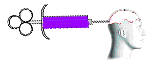
This theory was the first attempt to explain how mass audiences might react to mass media, since the 1920’s. As you can see from this particular diagram, it demonstrates that audiences passively receive the information by being “injected” into them via a media text, without any attempt on their part to resist or challenge the data. Governments produced propaganda to try and sway people towards their way of thinking, as they had just discovered the power of advertising to communicate a message. Therefore, the Hypodermic Needle Theory implies that the information from a text, passes into the mass consciousness of the audience unmediated, i.e. the experience, intelligence and opinion of an individual, are not relevant to the reception of the text. Overall, it suggests that, as an audience, we are manipulated by the creators of media texts, and we are powerless to refuse this idea, making our thoughts easily changed by media-makers.

2.       Drip, Drip, Drip Effect/The Cultivation Effect
This is where rather than be “injected” with information; this theory implies the audience are more like patients you get in a hospital on a slow drip feed. Therefore, it means if a message is repeated enough over a long period of time, it will eventually have an effect on the audience. For instance, the more violence you see over and over again it will make you less sensitive on violence. An example of this could be when people constantly hear reporting of  on the television or in the newspapers, heightens the audience’s fear on crime, as they believe it could happen to them, if it could happen to someone else. This theory can also be known as the cultivation differential.

3.       Two-Step Flow
As the mass media became an essential part of life in societies all over the world and did NOT reduce populations to a mass of unthinking drones, a more sophisticated explanation was invented. Paul Lazarsfeld, Bernard Berelson, and Hazel Gaudet analysed the voters' decision-making processes during a 1940 presidential election campaign and published their results in a paper called The People's Choice. Their findings implied that the information does not directly flow from the text into the minds of its audience unmediated but is filtered through other people’s opinions who they communicate and interactive with. Therefore, some people may be influenced by their friends or families choice or something, meaning they are not being influenced by a direct process, but by a two step flow. This diminished the power of the media in the eyes of researchers, and caused them to conclude that other social factors were also important in the way in which audiences interpreted texts.

4.       Reception Theory
In the 1980s and 1990s a lot of work was done on the way people interpreted a media text, and how their individual circumstances (gender, class, age, ethnicity, peers) affected their reading. This was based on Stuart Hall's encoding/decoding model of the relationship between text and audience. “The text is encoded by the producer, and decoded by the reader, and there may be major differences between two different readings of the same code”. However, by using recognised codes and conventions, by drawing upon audience expectations, the producers can position individuals creating a certain amount of agreement on what the code means. This is known as a preferred reading.

5.       Limited Effect
This theory believes that the media doesn’t affect the audience much as we are media literates, meaning we are sophisticated readers of texts who don’t get swayed easily by certain ideas.

6.       Media Dependency
Some people believe that we come to rely on our need of the media, meaning that people can’t go a day without reading magazine, newspapers, watching TV, anything that gives the audience information. Therefore, some people could argue that maybe gaining information is more of an addiction rather than a choice and you become dependent on it.

Conclusion:
I will make sure I consider each theory and recognise the codes and conventions in my magazine to grab my audience's attention. I now know that the codes I use will be interpreted differently by different people, so I am expecting a mixture of opinions and responses when my product is completed. I will try and get audience feedback through the process of my work, so that I can give my target audience a product that they would like.

Tuesday 21 February 2012

Understanding Audience


Whilst doing some research, I found this information about how to understand your target audience. As I have now a rough idea of what age to aim my music magazine at, I think I should take into consideration about these questions when making my media publication:

·         Analysis: Who are they?
·         Understanding: What is their understanding of the subject?
·         Demographics: What are their age, gender, background, profession, and so forth.
·         Interest: Why are they interested in your topic?
·         Environment: Where will they be reading, and what are the conditions?
·         Needs: What do they need from you?
·         Customisation: Do you need to adjust things for any special needs or interests of specific audience segments?
·         Expectations: What does your audience expect? Do they already have some questions they want you to answer?

Technology

To ensure I create an aesthetically pleasing magazine, I am going to need to use variety of forms of technology. In this slide show, it explains what technology I have used so far and what I am thinking of using later on, to help create my publication.


Saturday 18 February 2012

Moodboard

Here is my mood board of ideas, which I could use in my acoustic magazine. The pictures I have put in my mood board have been influenced by my research into acoustic magazines. I have included various artists from that music genre, conventional camerawork shots, magazine titles, different fonts, colours, sell lines, graphics, house styles and layout designs in this mood board. 


Throughout this publication, I used natural imagery such as the beach, trees, the sky, grass, lakes etc to portray nature, as you see most artists of this genre, singing in fields or located in natural looking surroundings. In my mood board, I have included some colour schemes that I believe would link to an acoustic magazine and the idea of nature. For example, green, blues, brown connote earth and nature, which I will try and include on my magazine. Also, the colours brown works well with the idea of acoustic guitars. Guitars will defiantly be included in my magazine, as it is the only instrument (well mainly) used on acoustic songs. So I will ensure that I stick to this convention by ensuring the pictures I take later on have a natural feel to them, e.g. lighting, style, pose, setting etc. By having pictures of current artists who write songs to this style of genre like Taylor Swift, Jason Mraz, Joshua Radin and Colbie Caillat etc, could be featured in my magazine somewhere; either advertising to win tickets to see one of the artists or an interview on their current album release etc. The use of the heart, represents that most songs in this genre is about love, how it has or hasn't worked out. By including quotes from the artists, I could use in my magazine as either a pull out quotes or catchy cover lines in the magazine. The use of the different fonts used on my mood board helped me get an idea of what style to use when I start experimenting for my mast head or articles later on. Overall, by exploring all of the variety of conventions that are usually included in an acoustic magazine, has helped me to think about what I may want to include in my magazine. 

My Chosen Genre

After analysing 3 magazine front cover, contents page and double page page, I decided that I want to do something more out of the ordinary, that isn't the most popular genre in the music industry.Therefore, I decided to look back at the variety of music genres in the industry to help me come to a decision. Once finding out all the genres that aren't so publicly marketed like Pop, Rock and Indie, I came to the conclusion of choosing between Reggae, Country, Acoustic, Folk and Classical. Overall, I believe that I have more knowledge on Acoustic music, as I listen to a variety of artists from that genre and feel more comfortable creating a publication for my main task! Not only this, but I believe that the genre of acoustic music is becoming increasingly popular and therefore, I feel I should create a new acoustic magazine, as there aren't that many out there at this moment in time!

Thursday 16 February 2012

Evaluating Music Magazine Deconstructions

After looking at a variety of music magazines front covers, contents pages and double page spreads, it has helped me learn about the typical conventions that is included and the particular house styles I prefer and may wish to include in my music magazine. This particular exercise of analysing each magazine has helped we make lots of decisions, from realising what appeals to me and what does not as well as what target market I would like to aim my music magazine. Even though, I'm still unsure of what genre to base my music magazine on at the moment, I have decided to aim my publication at mid-late teens to early twenties e.g. 16-21.

Front Cover:
I believe that a big, bold mast head and a striking main image should be the two key areas to focus on, as they say a lot about the magazine, as well as making engaging the audience more effectively. Therefore, I will try and ensure that I consider that fact when it comes to making my front cover. In particular Q's and NME mast head caught my attention as they were striking due to the use of colour and font they used. Even though the majority of the magazines I have analysed have had contrasting, bold colours, I think I prefer a muted colour palette, with only a few bright colours highlighting the key features, as I believe that less is more and with too many colours, the page will look cluttered and messy! With fewer colours, especially used for the cover lines, they will complement each other better as well as them being easy on the eye. I could try to keep to a conventional 3 colour scheme depending what working with the background I end up choosing. I will also try to incorporate a simple yet effective front cover, meaning that I need to have the right balance with not having too much text on the page, as it could detract from the main image. Throughout my analysis, I noticed that all the front covers main images had their models giving direct mode of address, which helps to engage their audience to buy their magazine. This to me is a clever concept and convention that I would like to incorporate in my magazine. Not only this, but a mid shot is usually used on the front cover, and normally positioned centrally, so the text can go around it and stand out on the page. I think I will stick to the mid shot on the front cover and play around with it, seeing if it looks better on the left, right or central. The use of a burst, on the front cover, seems consisted on each magazine that I have deconstructed and therefore, I think I shall stick to this convention when producing my final front cover.


Conventions of a Music Magazine Double Page Spread

Whilst looking through the entire double page spread you find in music magazines, there was variety of similarities that all of them seem to include. For instance:


Main image: this is where a picture dominates the double page spread, and usually will be based on the subject/person featured in the article.


Banner Headline: this is usually where a page wide headline (or ,maybe smaller) is used to inform the reader, what this particular page and article is on. 


Stand First: this is a paragraph that introduces and teases the audience about this particular article shown on the double page spread. This gives the audience something to think about, leaving a question in their mind, which they can find the answer to once they have read the article.


Main Article: this draws the audience into a magazine to find out more about the topic that is within this story line. It is also the most dominate piece of language on double page spread media text.


Quote: is picked out from a particular piece of text within the article, which is particularly eye-catching and grabs the attention of the reader. It is usually from the person who the article is about (but not always!).


Page Numbers: are used to inform the reader of what page of the magazine they are on as well as being about to locate a particular story they read in the contents page quickly and efficiently.


Drop Capitals: these are usually found at the start of the main text of the article to introduce the topic. These are used to stand out from the page so the reader can easily find where the article starts. This is particularly shown in Q and NME magazine below:

Conventions of a Music Magazine Contents Page

Whilst looking through all of the contents pages, there were numerous similarities that all of them seem to include. For instance:

The Contents of the Magazine: this is where the magazine tells the reader what is inside of the issue. Sometimes a brand can change the typical "contents page" to one this suits their target audience language.


Page Numbers: these exist to navigate the reader to the particular the page they what to locate the featured article they want to read. Sometimes page numbers will be accompanied by a subtitle or either a short summary/description of the article or even both.


Main Image: this is usually either relating to the front cover image of advertising one of the main sell lines that was on the front cover.


Mini Images: this is where the other main stories lines that was on the front cover, included on the contents have a picture with it to illustrate the feature. They are usually smaller than the main image presented on the contents page.